In the warmer months, the days are longer, and the colors outside are tawnier: sun-burnished browns in drier climates and verdant greens in others. Some home products are looking more and more like those natural surroundings as manufacturers respond to a demand for biophilic design.
An interest in this nature-centered approach — along with earth-toned hues such as terra cotta, olive and ochre — spiked around 2020 and has remained elevated since, according to Google Trends. Paint companies, including Sherwin-Williams and Benjamin Moore, also settled on nature-inspired color palettes as their color trends of the year, further popularizing the look. In response, some designers have offered naturalistic schemes that "have a timeless, grounding quality," Joe Waroquier, principal designer and owner of his eponymous design practice, said over email.
"I think people’s embracing of earth tones reflects a desire for authenticity, wellness, and simplicity," Waroquier said. "People are drawn to interiors that feel safe, stable, and rooted. These colors are also incredibly versatile, working beautifully across a range of materials and styles, from modern minimalism to rustic and traditional spaces."
Here are some ways product designers are meeting demand for this palette:
Furniture with natural wood and curving forms

By favoring natural finishes and rounded edges, furniture makers offer options that look a little more like the material from which they might've been made. For Blu Dot, a Minneapolis-based company, that might mean a low-slung console dubbed "Murmur." Stained a rich walnut, the piece's body features deep grooves, a rhythmic pattern accented by muted brass hardware.
Wallpaper printed with natural motifs
For a new collection, wallpaper company Rebel Walls channeled earth tones more overtly in a series dubbed "Eden Escape." Emblazoned with palm trees and ferns against soft backgrounds, the collection aims to bring "the golden hour indoors," according to a company press release, with "organic patterns that feel both grounded and elevated."
Burnished, matte metals instead of chrome
When it comes to metal finishes — from a doorknob to the curve of a metal sconce — earth tones center on matte offerings. For Corston, a maker of lighting and associated hardware, the aesthetic extends to a toggle light switch, which the U.K.-headquartered company offers in an antiqued bronze and matte brass.
"We’re seeing a real shift toward materials and colors that feel grounding, and earth tones naturally offer that sense of warmth and calm," noted Edith Langford, Corston's chief stylist, over email. "These tones bring a quiet richness to a space without overwhelming it. There’s a timeless quality to them — a sense of honesty and permanence — that feels especially relevant in how people are designing their homes today."
Next generation terra cotta
After adding a green glass brick to its roster, brickmaker Glen-Gery launched Sk1n, a terra-cotta system for residential facades. Although commonly associated with the red roofs of Mediterranean-style homes, the clay-based material has an architectural history spanning thousands of years. For this modern iteration, Glen-Gery fires the rectangular tiles at high temperatures, creating a durable option available in "seven nature-inspired hues" that users can apply over new and existing facades alike.
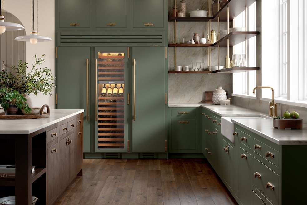
Appliances intended to reflect their surroundings
After settling on a gray-tinged olive as its 2025 color of the year, the Missouri-headquartered refrigerator-maker True Residential slipped the color option into its lineup of indoor and outdoor appliances, including a new 24-inch-wide selection. In addition to offering a certain "comfort and coziness," the company said over email, the leafy color might also remind a user of food, including a "dry martini ... garnished with plump olives" and "a white wine, lemon and caper sauce that belongs on everything."